Pattern Play: A How-to on Mixing Patterns
So, here’s the thing: Mixing patterns is hard. But also here’s the thing: When there isn’t enough pattern in a room, I think something is missing and, also, to be totally honest, kinda boring. In my mind, FYI, texture counts as a pattern. Case in point: for a while now, I’ve been thinking that there is something off about our office. Yes, it has patterned curtains and pillows. Yes, it has vibrant color. And yet…I feel like it’s kinda bland. After months of thinking this, I finally realized what was missing: more pattern (and texture). I have thought of different ways to change that that I think will be fun and I will be employing a few tips on how to mix patterns.

First of all, this post was inspired by a client project that started out with a question: how to mix patterns in a nursery. Check out that client project if you haven’t yet. It’s here and here. Secondly, here are some tips that you may find helpful (and that I’ll be applying to the office):
1. What I find to be a great place to start in designing a room is to determine what kind of feel and atmosphere you want a room to have. Patterns play heavily into this. Formal, playful, muted, sterile, all of these emotions come out in color, texture and pattern. Another helpful place to start is to test out your pattern play on curtains, pillows, rugs and blankets/comforters.
Sometimes people think that having multiple patterns means that a room will look crazy busy and hectic and have to be really colorful, but that’s not always the case. See this example:

You’ll notice the mixture of patterns on the pillows on the chair, couch and floor, as well as the textured weave of the layered rugs. The reason this mixture works is because they are all in the same neutral color scheme and don’t compete with each other.
2. Vary the scale of the pattern. Using stripes as an example, if you have a chair with a thin stripe upholstery fabric, then consider a pillow with a larger stripe or other pattern to balance out the thin stripe on the chair. More than one of the same scale of stripe pattern so close to each other will look kind of dizzying.

This pattern play by Meg Freeman works well for several reason: all of the patterns in the pillows and rug are the same color (cream/white and black), they are all of similar shape (triangles or angles similar to triangles) and of different sizes so your eyes bounces around to everything.
3. Have patterns that echo each other with a similar shape, such as all florals, or varying triangles (actual triangle, ikat, diamond). See the above photo example for echoing the similar shape.
4. Use colors that are similar in tone, such as all pastels, all soft neutrals or all jewel tones.

There is a serious mixture of patterns going on here, but it all works because the rugs are of the same style and color tone, and all the other patterns as seen on the pillows are of the same tones and colors as the rugs (reds/browns and dark blue).

Here is another example of going bold with pattern. It works because all of the colors are the same: various rich blues broken up by white or off-white. Even though each actual pattern is different and there is a lot of color here, it looks really cohesive because of the limited number of colors. It also works because the pattern is broken by a solid, even though it is quite a bold solid. Which leads me to my next tip.
5. Break up pattern with solids to give your eye a break in between patterns. As an example, check out Siri’s living room from the Instagram account @Roozen.Abode. You’ll notice three bold patterns: the wall hanging, the rug and the blue pillow. The patterns go well together as they match and complement each other but you get to rest in between the patterns by all of the solids in the couch, chair, shelving and coffee table.

6. Go with a minimum of three patterns. Three seems to be a magic number in everything. I think going with at least three patterns makes it seem intentional and gives you enough pieces to move your eyes around a space.

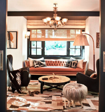
In this room designed by Kelly Wearstler, you’ll notice a lot of what we talked about already. Similar colors and tones (warm browns and pink, black and white/cream), varying scale (pattern on pillows is similar but not the same size as the pattern on the throw blanket and the scale of the pattern on the rug is different from both), broken up by solids (the couch, chairs, stool, lamp and shades), and now, of course, the magic number of three (rug, pillows, blanket). You’ll notice how the patterns of the pillows, blanket and rug make your eye move around the room.
So those are my tips on how to mix patterns. Do you have any additional tips? Are there any design questions you have that I can answer? Sound off below.


