Client Project: Lincoln Center Living Room
Oooooh, guys, I got a good one! I’m working on a very fun client project in which I’m helping a couple essentially start from scratch in their new home. This couple moved from Los Angeles to New York City and bought a one bedroom apartment near Lincoln Center in New York City. It’s got great space with huge windows that let in lots of light and provide a good view of their neighborhood. They are in the months-long process of converting some of the space into a second bedroom/office. They moved to New York with no furniture and the wife, someone I’ve known a very long time, has brought me in to help take the apartment from a good space to a fabulous space that reflects their personalities and really feels like them. I will call this project, and therefore the client, #LivingLaLincolnCenter – I know, super cheesy, BUT I DON’T CARE! Want to see?
The #LivingLaLincolnCenter project entails outfitting the master bedroom, and dining and living spaces that are one big open space. Today, we’re going over the living room.
The client wanted a modern style, with lots of clean lines, but something that looks and feels really comfortable. She envisions hosting a lot of people and having space for all of her guests to sit comfortably in the living and dining areas. That’s the general feel/function and look of the room. And now onto color.
She likes lots of whites and creams, generally. In addition to that, the couple, who is Indian, is incorporating the principles of Vastu Shastra in their home. Vastu Shastra is a guideline based on ancient concepts that informs decisions made in designing a home. They had an expert come in and, as part of that process, they had colors chosen for them for specific rooms. Based on this, teal and yellow are the accent colors in the living and dining rooms, and rose/blush is the accent color in the bedroom.

By the time she brought me on, she already had a couch, TV stand and rug in the living room and had purchased teal velvet fabric to upholster a long cushion for the large windowsill. Based on what she said she was looking for and what I thought would work really well in her space, I created this shopping list:
- Chairs/seating in the living room
- Accent chairs (one or two, perhaps with ottoman)
- Table and floor lamps
- Coffee table
- Cool corner shelf for prayer corner
- Pouf
- Tall plant/planter
Other elements that we will incorporate once the renovation is complete and we see how everything looks in the space are potentially curtains (the apartment came with blackout blinds that she likes, but doesn’t add a decorative element) and artwork to personalize the space.
Two important things to know: the entire project is on a tight budget and she doesn’t like furniture that has been used unless she can 100% trust the source that the furniture is completely clean.
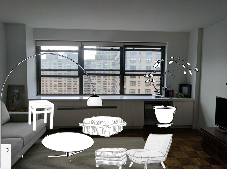
So, with all of this in mind, I designed what I think will be the best layout for the room, creating a space where people want to hang out with plenty of tiered seating, doesn’t close itself off to the dining room and doesn’t detract from the view. Also, all sources are well-known with good pricing options and offer sales frequently.

You can see in the above layout the couch, rug, TV and TV stand that she had just bought for the space. That entire windowsill will be covered with a teal upholstered cushion that she is getting made.
Here are a couple of inspiration photos that I chose because of the warm and inviting feeling they gave off, with neutral colors and wood accents, bold accent colors, lots of natural light, and an overall comfy and modern design.


And now for the furniture and decorative elements. Here is the couch from West Elm that she already had (I don’t have links to the rug and TV stand).
I designed three options that incorporated the teal and yellow colors, offering both neutral and bold options. But one thing I wanted to do was incorporate rose/blush to tie into the master bedroom, when that gets done as rose/blush is will be the main accent color there. Here are the three options with links to purchase items below each one.
Option 1:

In option 1, blue/teal is the main color with touches of color elsewhere. The reason I like this chair and coffee table combo is because the pointed top of the back of the chair pairs well with the triangular shape of the coffee tables. I really like the idea of a vintage kilim rug turned pouf as one of the floor pillows for extra seating options.
Blue chair / nesting coffee tables / kilim floor pouf / additional floor pillows / light pink throw blanket / floor lamp / pillow for window bench no longer available / pillow for chair from Target, no longer available
Option 2:

This is the most neutral option. The ottoman that comes with the chair can be used as a seat for guests. The curves of the chair, ottoman and coffee table go well together.
Chair and ottoman (another version here) / coffee table / pillows and floor lamp from Target, no longer available
Option 3:

So, which option do you think #LivingLaLincolnCenter chose? Which option would you choose? Sound off below and come back next week when I reveal where this living room is going.
To see other home design client projects, visit here and here.


