Beautility Room Renovation: Inspiration and Moodboard
Last week, I introduced you to a small renovation happening at our house that I’ve dubbed the “beautility room,” aka a joint powder room and laundry room, which is often referred to as a utility room, as well as a new mudroom. To see the introduction to the beautility room renovation, the story behind it, the before pictures and the new floor plan, check out last week’s post here. Ready to see the inspiration and moodboard for the new spaces?
There will be two defined spaces after the renovation: a larger powder/laundry room, aka beautility room, and a smaller mudroom. Because of the size and function of the space, my design focus has been on the beautility room. I’ve have been pinning inspiration like crazy for any and all bathrooms over the years, as seen here. But, for just a powder room, here is what has been inspiring me for the past few years:


As you can see, I’m attracted to vintage vibes with those console sinks and classic subway and penny tile, as well as bold color and pattern. In fact, I basically dreamed up that last photo and then Liz Kamarul posted it to Instagram from a New Orleans hotel and it was like my dream was a reality.
There are a few things I wanted – like a bold wallpaper on the walls of the bathroom and subway tile in a herringbone pattern for the floor – but due to several factors, the wish list has had to change. I won’t get into the boring details of the back-and-forth regarding the floor tile but I decided against doing wallpaper in the bathroom because it would compete too much and even clash with the stained glass window in there that we’re keeping.
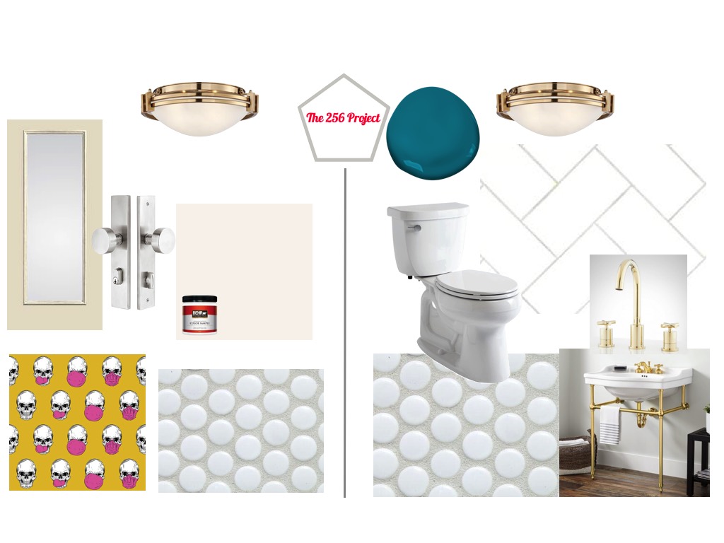
So, instead, here is the moodboard for the entire project:

On the left, is the mudroom. We’re replacing the back door with something like what’s pictured here primed in white so that I can paint it something later. Still need to figure out that color. Planning on using Emtek hardware in a nickel finish, as pictured here. We’re going with nickel because the screen door we’ve chosen comes with hardware in limited finishes so we’re matching them up. We’re using this light from Lamps Plus, one in each space, as pictured here. The walls and trim will be painted Powdered Snow by Behr, a color that always comes off as a lot pinker in swatches online than it does in person. This is the white we have used throughout the house and it’s a pretty bright white. The flooring for both spaces will be a glossy white penny tile with a medium gray grout (the penny tile pictured here does not have the same color grout we’re planning to use). The piece de resistance that you’ll see in the mudroom is this wacky wallpaper of a skull blowing bubble gum from Walls Need Love. I have been eyeing this paper for months now and didn’t know when I could ever use it. Since the beautility room will be separated from the mudroom by a new wall and pocket door, and the pocket door will be a slab door, I will cover the slab door in this wallpaper. Still haven’t ordered the slab door or the hardware for that, though.
As mentioned, you enter the beautility room through a pocket door and you’ll see this: all the walls covered almost halfway up with glossy white subway tile laid in a herringbone pattern with the same medium gray grout used on the penny tile, and the walls above the subway tile painted in Benjamin Moore’s Caribbean Blue Water. The trim and ceiling will be painted in Powdered Snow by Behr…or should the ceiling be painted in the same blue? Hmmmm…. We’ve ordered this console sink from Signature Hardware and are thinking about ordering this faucet but still haven’t done that. We already picked up this budget Kohler toilet from Home Depot.
You may be wondering what’s going on with the mudroom since I haven’t shown anything here that demonstrates how we’ll use it. Well, we aren’t custom making anything for it. We may either keep the vintage wardrobe we currently have, as pictured below, or get a new one. But I don’t want to focus on that yet since it doesn’t require the help of the construction crew. We can figure that out when all of the main work is done.

You can see that this moodboard – and hopefully the final result – draws directly from the inspiration of bold and vibrant color and pattern and vintage and classic elements.
To be honest, there are still a lot of moving parts. During the span of the day when I created this moodboard, I had cancelled one sink order and ordered the one pictured here, cancelled the door hardware and am attempting to order a replacement, and was on the phone 10,000 times with customer service from various stores and manufacturers. Sigh. So who knows how much more will change between now and the final product.
What do you think about the design ideas for this beautility room and mudroom? Any color suggestions for the back door? Should I just paint it the same color as our front door exterior or the same color as the wallpaper of the front door interior? What do you think about painting the bathroom ceiling the same blue as the walls? Weigh in below because I could use your help!


