Seeing Red in Interior Design
Have you noticed how the color red is often treated as the danger zone area in interior design? Rarely do you see red significantly featured in any space, no matter how long you comb through Pinterest, design sites or magazines. What’s the deal?
Grace Bonney of Design*Sponge posited a couple of years ago on her site why there seems to be an absence of color overall in design, especially the design usually seen in mass media. Basically, white took over as the predominant color and bold, bright and dark went to the wayside. That has meant, buh bye red! Designer and blogger Emily Henderson has talked on her site about how red has gotten a bad rep all these years. I used to love red. I remember walking into an apartment way back in the day in New York that had red carpet and red walls and I was in love. I swore that one day when I was grown and decorating my own place, I would do something like this. But all these years later, I’ve been somewhat turned off from red. In fact, the only thing we have in our house that’s red is a locker TV cabinet from IKEA and a throw blanket.
But there are some designers who do red incredibly well and so I checked in with them about how to best incorporate red into a home.
“I think red is a color shied away from at the moment due to how it was used in popular design over the last few decades, but I’m hoping the pendulum will swing back eventually,” said Gwen Hefner of The Makerista, a maker and designer whose home is a beautiful display of saturated colors as well as neutrals. “It’s such a beautiful color that evokes wonderful emotion and feeling. It couldn’t be more classic either. I think of royalty, religion, English hunting, Diana Vreeland…many beautiful things when I think of red!”

“I LOVE red! I don’t know what it stems from, but it has always been a go-to color in my art,” said artist and designer Angela Chrusciaki Blehm, whom I recently interviewed about incorporating art in the home. “I’ve always had touches of it in my interiors, but lately I’ve been bolder with it. It really seems like a neutral to me—every color goes well with it. It seems to both calm and energize a space. Our children’s playroom, walls and trim, is all deep red, and it feels like the coziest of cocoons. I also love the playfulness of it. It makes an appearance in every room of our home.”

So, let’s just say you are a bit shy about bright, dark or saturated colors in your home but you like red and want to give it a try. How do you do it? Centered by Design has a few tips here and examples of how different designers are doing it. Gwen and Angela also have a couple of simple tips.

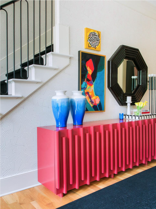
“Old red is the best kind of red when it comes to accessories because it feels genuine and never cheap. A great piece of art with a pop of red is wonderful too!” Gwen said.
“Try a dash and see how it punctuates a space!” Angela said.


