Leveling Up Design at Home
May was an exciting time for interior design with design events happening in and around New York City. I went to a few of them, including two show houses – the 47th Annual Kips Bay Decorator Show House in Manhattan and The Valerie Fund Show House in Plainfield, NJ – and walked away in awe of all of the designers’ creativity. I also walked away with a few interior design basics that anyone can use to level up their design at home.
What designers did with texture and layers was impressive and beautiful. You don’t really see in photos just how much texture interior designers incorporate into every piece of decor. From wallpaper that is embossed, tiles that are 3D and really pop off the wall, curtains and pillows that are embroidered, to paint that shines, all of it put together makes for breathtaking design.
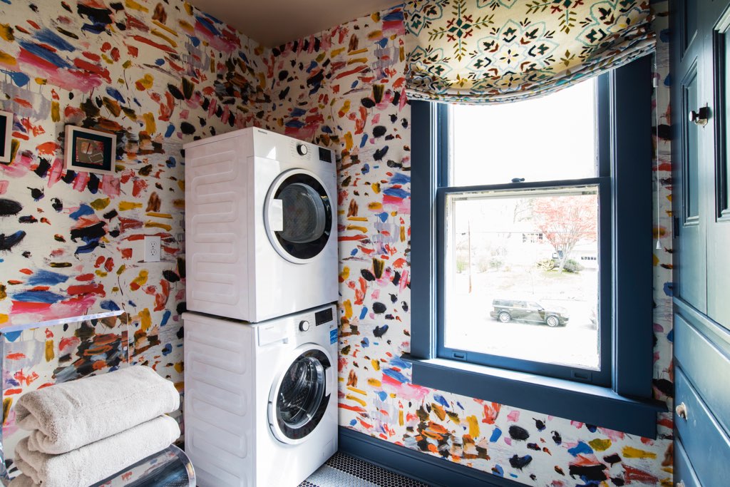
One of the spaces my friend Gail Davis designed was the laundry room at The Valerie Fund Show House and her work is a perfect example of beautiful texture and layers. The shades in the laundry room look like they are patterned but, in person, you can see that they are embroidered. The wallpaper looks like it is a print but, in reality, the paint brush strokes are raised, providing texture and an additional visual pop. It’s like everything is 3D x 2.

Another friend, kitchen expert Jim Dove of Dove Design Group, designed the champagne bar at the Kips Bay show house. It might be the tiniest room I’ve ever seen but all the details helped make this room have one of the biggest impacts. Everything was chosen with care, clearly, and everything was meant to be touched or looked at closely to get their full effect.

Color isn’t for everyone but if you’re going to do it, then really do it. That’s the message I received. I saw plenty of tone-on-tone in deep, saturated colors, like a living room by Samuel Robert Signature Spaces in which almost everything was drenched in the color of red mahogany. From the candles, to the pillows and sofas, and the paint, it all worked so well together. And because everything had its own texture – different finishes of the paint for the walls, trim, and fireplace, as well as the textiles, wax candles, artwork – nothing fell flat.

Another way to do color that I saw and really appreciated was in the kitchen. Designer Swati Goorha used what looked like a green stain for the wood kitchen cabinets. The color was vivid and deep but it let through the wood grain, providing another layer to admire.

This is not a new concept in interiors at all, but it’s one worth reinforcing: the ceiling is the fifth wall. In terms of decor, it holds more than just a light fixture. Whether it’s paint color, wallpaper, paneling, intricate molding, or some other layer, what I noticed over and over again is that the ceiling needs something! It helps draw the eye upward and adds dimension to a flat surface. The following images are two great examples.


Sometimes you see a space and think it’s beautiful but you can’t pinpoint exactly why. Often times, the reason you love a space is because of all the organic elements peppered throughout. Organic details can be made of wood, stone, concrete, and metals, as a starting point. There is one space in particular, a space dedicated to a bar by JAB Design Group, that used just about all of these organic elements in a host of neutral colors to stunning effect. One wall was all shuttered glass shelving. On the opposite wall was a fireplace surrounded by a carved wood tile wall. In between were pieces of furniture and decor made with a mixture of other organic elements. The space was colored in mostly black, creams and natural wood colors, but it all felt so alive.


Those are just a few interior design basics that anyone can use to level up design at home: texture and layers, saturated color, ceiling as the fifth wall, and organic elements. What will you incorporate into your home?
For other design help, check out this post on color and this post on design rules.


