Fall 2019 One Room Challenge: My Favorites and Some Tips
The fall One Room Challenge wrapped up last week and these projects were insane. I’m sharing several of my favorites here as well as a couple of tips from a few of these fabulous interior designers and DIYers.
But first, a little background: The One Room Challenge is a biannual event every April and October where 20 design influencers are selected to take the challenge as Featured Designers, and transform a space over the course of five weeks. In addition, anyone can take part as a guest participant, which I did last year. You can catch up on my One Room Challenge project here.
Like I said, some of these projects were insane!
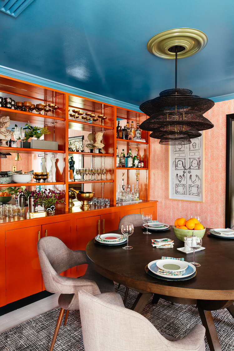
Let’s start with interior designer Diane Rath, who transformed her dining room and adjoining sunroom and I am floored. I don’t think I’ve seen anyone use orange in interiors so masterfully as she did here.


Diane’s design is bold and she stuck to her guns to see it through. As she tells The 256 Project, “Trusting my instinct was – and always is – key. I get push back a lot because I tend to like things that aren’t always ‘safe,’ but I find that when I start heading down that safe path, I’m never truly happy in the end. I’m a huge lover of weird bits paired with edited and sophisticated design, and I’m always excited by the result when I listen to myself. And that should hold true to whatever your style. If it makes you feel good, go for it, but if you get an icky feeling, turn around!!! It’s your gut telling you what’s best for YOU.” See her full project here.
Interior designer Erika Ward killed it with this kitchen renovation. As she wrote here, that tile and all the kitchen storage helped turn this kitchen into a major wow factor in both looks and function.

Look at all the details in the Homme Boys’ renovation of their hallway and master suite, seen here. You see how that pill-shaped mirror fits perfectly into the custom-made headboard? And I am all about this dramatic hallway!


There is so much to see and take in with Jewel Marlowe’s reveal. She worked on three spaces – living, eat-in area and kitchen – which is totally crazy. But she pulled it off, as you can see in full here.


These spaces all tie into a dining room on the other side that she renovated previously and every room flows so well together. Here’s what she told me about that:
I love all the texture, pattern, and color in interior designer Whitney Jones’ new dining room. I also love how she styled it, which you can see here.

Finally, you have to check out all of the fabulous details in the spaces that interior designer Nicole White redid here. The wood wrapping on the walls and ceiling in the living/dining area, along with the coffee bar area tiling, and then that beautiful blue and artwork in her mom cave are all so beautiful!


Nicole shared a special tip with us about how she got it done and something for anyone to remember when they go to tackle a project: “Be flexible. Always. We changed quite a few things from our original rendering but the key is to keep the overall vision in mind and don’t sweat the adjustments you need to make. That’s part of life.”
What do you think of these One Room Challenge projects? Got any favorites of your own?


