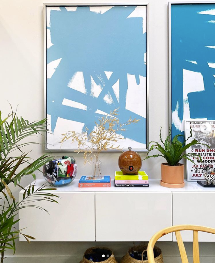
The Power of the Vignette
If you’re as bored as I am with EVERYTHING – although grateful that our family still has our health and a steady income, and for all the good that we experience while trying to survive the pandemic – then you are probably itching to make some changes in the spaces you see every day. For me, that is our home as we are working and living at the cozy cottage full time. Tinkering with a space can be as small as perfecting the vignette, that small grouping of objects in a space that catches your eye and, when done well, brings life to a space. A well-done vignette can be a powerful decor moment in any room.
The above photo is an example of a beautiful vignette. So, how is it done? Interior designer and TV personality Nate Berkus shares tips here, and HGTV has a few additional tips to consider here. In short:
- Layer objects.
- Use pieces that tie into the design of the rest of the room.
- Display objects in odd numbers.
- Vary texture and depth.
- Pay attention to scale.
Here are a few vignettes I’ve seen recently that I thought were powerful.


Looking for more inspiration, check out this story on neutrals and this story on how to use the color black at home.


