Kitchen Renovation: Inspiration and Moodboard
We are inching closer to the start of our kitchen renovation and planning is very well underway. We’ve got almost all of the major items ordered or we’re at least checking them out, so it’s time to give you a sense of what we’re going for in this space, from inspirational images to the kitchen moodboard.
First, to catch up with the Kitchen Renovation series, start with the intro here where I share the questions to ask contractors before starting on a project and their reactions to our kitchen, and then go here for architectural renderings and cabinet drawings and get a sense of what is changing on the first floor.

What we are going for in our kitchen is taking a small space and making it feel more open by literally opening up a few areas without actually expanding the square footage or footprint of the space itself. Our plan is to extend the countertop from the kitchen through a what will be open partial wall into the adjacent living room to have stools and a new seating area on the other side. I absolutely love the kitchen above designed by Crystal Sinclair Designs and the veined stone countertops that extend into the living area and dark cabinets are beautiful.


We will be exposing brick in one living room and over the oven in the kitchen. We don’t know what the quality of brick will be under all that plaster but hoping we can create a cool effect and vibe like in the photos above.

And I have absolutely loved the above kitchen of interior designer Jessica Davis, as I mentioned in my Designer Spotlight interview with her here. I hope to borrow from the eclectic design and cozy yet fun vibes that she pulled together in her old kitchen for ours.
There are a couple of things we don’t yet know about our kitchen, which impact design choices. The first is, what will the brick look like under the plaster and what color and texture options will we have to work with once it is uncovered. The second is what our flooring will be, since there’s a chance we may find and hopefully be able to save the original flooring. If not, we are going with white tile. Once demo starts and we have more information, then we’ll be able to make more design choices.
For now, here is the kitchen moodboard, which includes a few major pieces we’ve already purchased or scoped out.

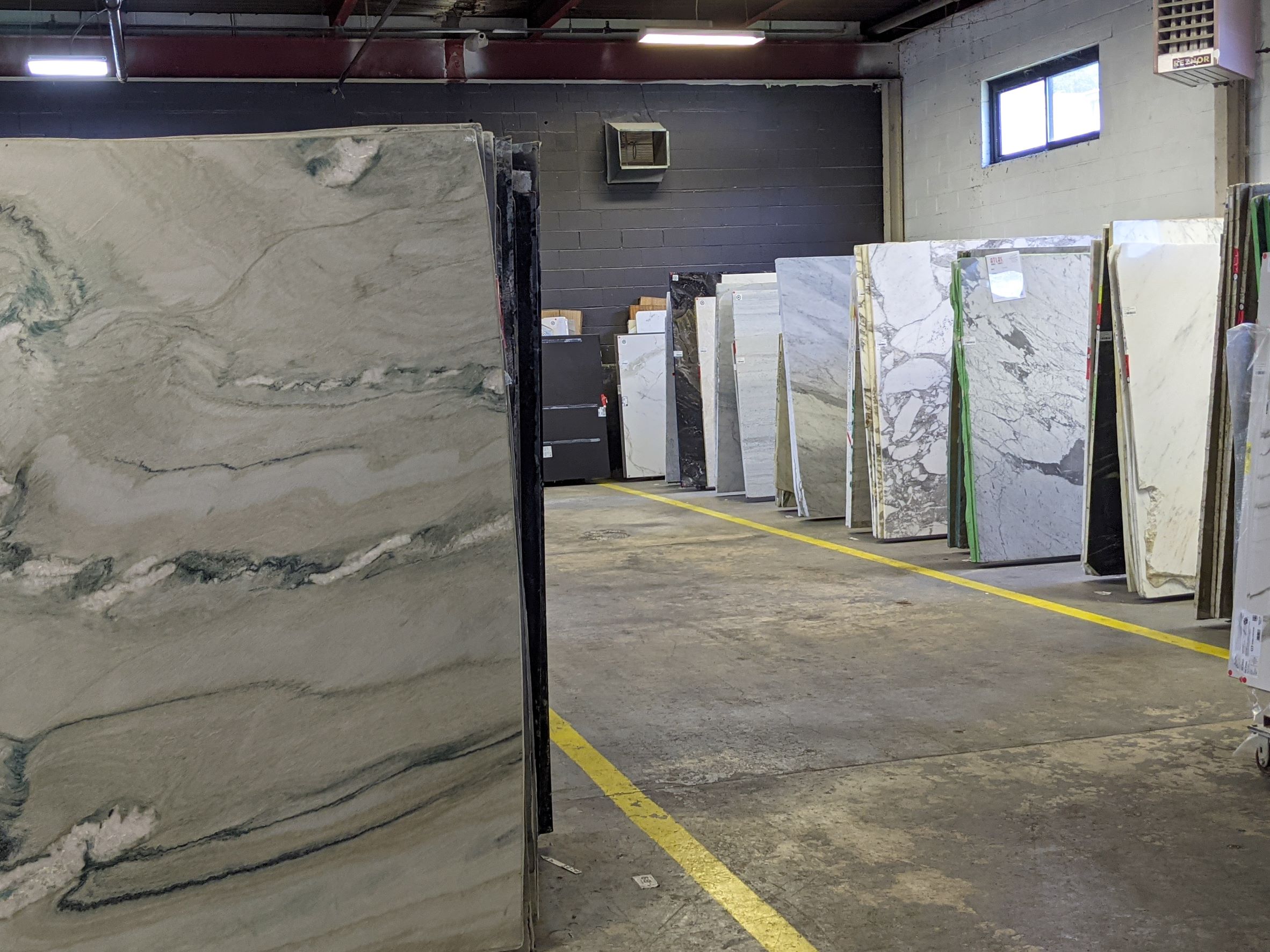
We have chosen flat front, modern cabinets from MasterBrand Cabinets in the Decora line in a dark, yet vibrant green from Sherwin-Williams called Cascades SW 7623. Full disclosure, I work in public relations and MasterBrand Cabinets and Sherwin-Williams are clients of my agency, but everything we are getting and doing for this kitchen is completely out of our own pockets. We already had the LG refrigerator, and just purchased a GE Cafe Series slide-in gas range. We are planning for white subway tiles on the walls (pattern still to be decided!) in addition to the exposed brick. For the floors, if we can’t use the original materials, then we’re planning for white hexagon tiles. We are deciding between veined quartz and quartzite countertops with some hints of gold and brown in them to match all the hardware we’re bringing in, which will be gold and/or brass.
Overall, we’re going for colorful modern with a classic touch so the kitchen doesn’t feel out of place in our 1903 cottage.
What do you think so far?
Next, I’ll share how we are preparing for the renovation at home and everything we are buying for the new space. Don’t forget to follow me on Instagram for real-time updates, including how we discovered a cabinet that we didn’t know existed this entire time!


