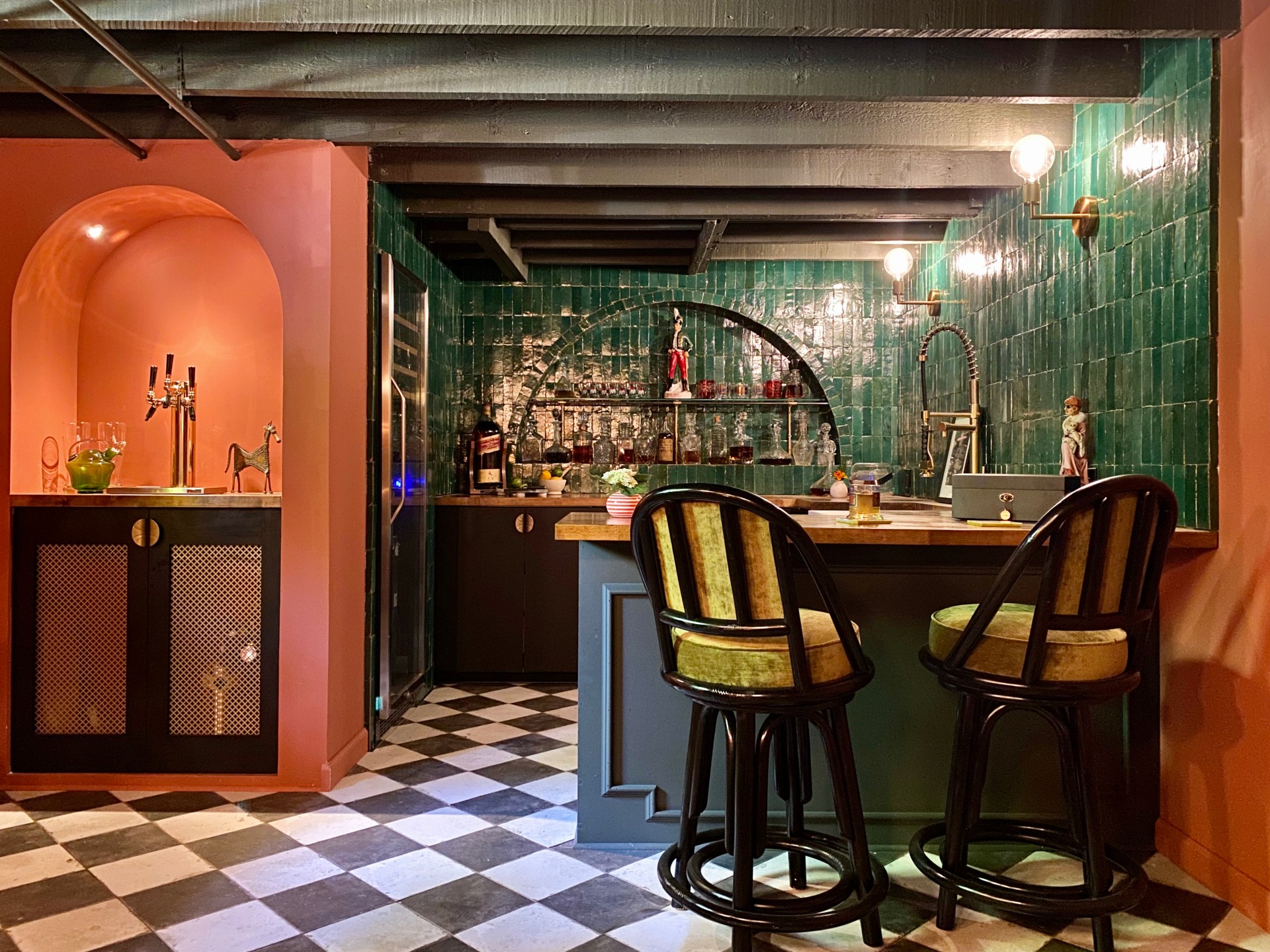
Designer Spotlight: Kate Pearce
I love fun DIYs, beautiful design and a good cocktail, so when I saw that vintage queen, interior stylist and DIYer Kate Pearce was working with her husband Billy to turn part of their basement into a speakeasy, I knew I wanted to talk to her about it. She and her husband worked on this project as part of the One Room Challenge and you can get all the details on her site here. Lucky for us, she’s talking more about the space challenges and design choices that went into this beautiful space.
Q. You had some design challenges to confront when building out this speakeasy and you managed to design a beautiful space without a lot of light. In general, do you have any tips for anyone designing a space without a lot of light?
A. Yes! I think when people are working with a space that has little to no natural light, the tendency seems to be to fight the darkness. Most people start slapping white paint everywhere, adding lots of artificial lighting, and using neutrals in their décor. I think that often feels flat, unconvincing, and gives the space a very artificial vibe. My advice to most people facing a space that lacks natural light is to run with it. Embrace moody colors, mood lighting and a dark palette. I was able to brighten the room a bit with the terracotta color on the walls, but otherwise went with jewel tones, blacks and natural woods. I opted for sconces on the walls in lieu of overhead lighting to ensure the light gave off a warm glow, instead of making it feel like an operating room (which, by the way, usually has no windows, lots of whites, and lots of artificial overhead lights).
Q. You wanted to create this speakeasy for your husband, who loves brewing beer and playing poker and didn’t really have a space for it. Why did you decide to go the speakeasy route and what’s it like having this kind of space in your home?
A. Billy really wanted a brewery and didn’t care much what it looked like. I knew it was going to take him many weeks, if not months, to build it, so the compromise was that he would let me design the space so that we BOTH got something out of the deal. I decided on a speakeasy because our home was built in 1910, has exposed beam ceilings, locust poles for beams, and overall just kind of screams “BUILD A SPEAKEASY IN ME!” Ha! The lack of natural light, and the early 20th Century elements of the space made it both really fun, and really easy, to turn this basement into a space that smacked of art deco delights and Prohibition-Era seduction.
Q. You are a vintage queen and combined DIYs with vintage and modern design in this space. Do you have a tried-and-true tip for combining new with old in a space?
A. I think if I could name one element that defines all of my spaces, it would be that mix of vintage and modern. And, to be honest, my strategy for each space looks a bit different, but the one thing I would say is I LOVE mixing eras. I think that’s what keeps a room on its toes, and prevents it from being too predictable and falling flat. For this speakeasy, I was dedicated to infusing the space with art deco vibes and used plenty of authentic vintage art deco, but balanced that by bringing in modern-day art deco pieces, and even some fun mid-century pieces that played well with the undulating art deco shapes. For example, the marble table tops are mid-century and very typical mid-century in their prominently-veined marble tops, but the scalloped edging paired so perfectly with the art deco bases I placed them on. In other spaces, the color palette does more of the dictating. For example, I am currently working on a refresh of my library space, and I will be bringing pieces together from different eras that all play nicely with my pink and green color palette.

Q. Billy loves beer but what does Kate like? What are one or two of your favorite cocktail recipes or one of your reliable go-tos?
A. I really like everything! I’m not a huge beer drinker, but I do love sampling micro-brews from different places. I love skin-contact wines and Pinot Noir, but I also love a good mixed drink. This summer I discovered “Painkillers” and they’re my new go-to: 2 ounces Rum, 4 ounces Pineapple Juice, 1 ounce orange juice, 1 ounce cream of coconut and garnish with freshly grated nutmeg. I promise you won’t be sorry!
Thanks to Kate Pearce for sharing some wise words on her design choices and thinking! You can follow her on IG here and check out her site here. For more conversations with DIYers, stylists and designers, check out the Designer Spotlight series here.
Cheers!


