Primary Bedroom Update
We recently updated our primary bedroom to finally “finish” off this space and I’m sharing all the details here. You may remember at the start of the year, I mentioned wanting to update this primary bedroom and shared inspiration photos. Well, the end result is nothing like I thought it would be.
For a journey, you need to start at the beginning, so here is the color our bedroom was and what inspired the color and vibe when we painted it eight years ago. That blue was a vibrant color but was never the right blue (I think I realized later I really just wanted a teal, which we ended up using in our downstairs beautility room years later). It also was never the right sheen since it’s better to use flatter sheens on old walls or walls that aren’t particularly smooth since the higher the sheen, the more obvious flaws show. It only took eight years but I decided it was finally time to repaint the bedroom and, while doing it, finish the only thing that still went unfinished in our primary bedroom, the closet doors. And if you really want to continue down memory lane, here is more on what I had been thinking about regarding closet doors back when I thought I was originally going to do something about our lack of closet doors.
But back to our current journey.
Our bedroom doesn’t get that much natural light so I thought it might be better to keep the new color on the darker side and I was really interested in the darker neutrals of warm grays and deeply dark blues. In order for a fresh start, I primed our bedroom so it would be easier to evaluate the new colors against the white primed walls rather than the existing blue. But then something weird happened. I actually liked the white! It was refreshing to walk into the room and it feel so light and bright rather than the darker room that it had been for so long. Even though the primer was too bright, I still really embraced the overall impact.
But I still went along on my dark neutral journey and tested out three really dark colors: Midnight, After Midnight and Notre Dame. We left those samples up for a little while but the colors weren’t vibing with me. I was more drawn to the primer than the dark colors. So I went in another direction and got three new samples, this time warmer beiges thinking that I could still go with a neutral and by making it a lighter neutral and keeping it warm, it would look good with a lack of natural light but still feel bright in the room. Those three new samples were Interlude, Kingsport Gray and Ashley Gray.
But that didn’t do it for me either. Daniel suggested I do something surprising so I thought about it and thought about a new direction. I went from three samples, to six samples, to NINE! I went to the store for the third time for three new colors: Castle Walls, Fossil and Swept Away.
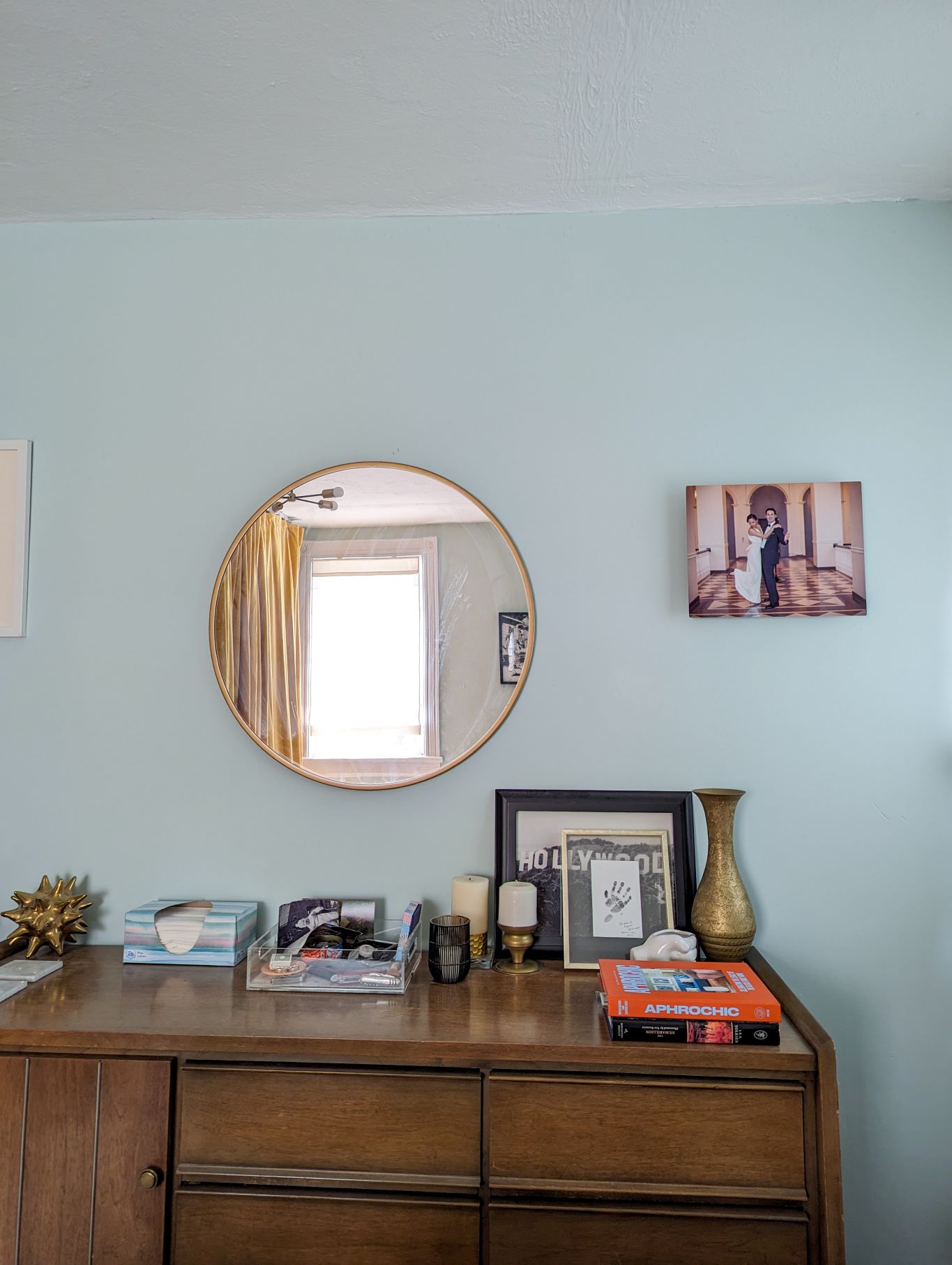
I explored a lighter neutral and also got two light greens. Both greens were of a sage variety with gray undertones, but one was lighter and brighter, and the other darker and moodier. The inspiration came from our brass headboard that I built. The aging process of the brass left light green tones throughout, and the new paint samples matched beautifully. Those two greens instantly became the finalists and I ended up going with the one that Daniel and August said they liked better: Swept Away. I guess I shouldn’t be surprised that the final choice for our primary bedroom has a name and color related to the ocean, since that’s my happy place!

The only thing to do now was the closet doors, which I knew would be a curtain since we decided a while ago that adding real doors isn’t a priority for our budget considering what else we’d like to do in the house. I got this flexible ceiling mount track and mounted it to the ceiling and then bought two packs of curtains (Sanela in golden brown) from IKEA that, in total, were wider and longer than I needed. I sewed the panels together – two panels to make one big curtain on the left and two panels to make one big curtain on the right – and hemmed them to the right length. The golden yellow wall of curtains mirrors the yellow of the brass headboard on the opposite side of the room and makes the ceiling look even higher.


Now we have a light green primary bedroom that feels bright and airy rather than weighed down, accentuated by metallics, and grounded by the neutrals or our new bedroom rug and the woods of our midcentury modern furniture.


Comments
Wow! As a completely unbiased observer, and a person who is definitely not Daniel, your husband, but rather a completely different individual who has different hair even, I have to say that this renovation turned out magnificent! The room is, or rather appears to be from these pictures, as I, a person that is not Daniel, have never seen it, light and airy and just super relaxing. Chill vibes only!
I’m not Daniel, so I don’t want to speak for him, but I bet he’d say something like “this is really fantastic and I’m so grateful for all the work you do to make our home beautiful, inviting, and a joy to spend time in.” Again, not Daniel, but that sounds like something he would say.