New Column: Friday Faves
The 256 Project has been focused on how we’ve been making our first house a home through plenty of projects and through translating my grandmother’s recipes, with the occasional client project thrown in. I’ve never shared with you much beyond my project world, but that changes today. I thought I’d start a new weekly column every Friday so I can share with you some of my favorite designers, stories, house tours, interviews and recipes of the week – basically anything that I really liked that falls into the shelter and food categories. I’m calling this new column “Friday Faves” and it starts now!
Social Media:
One of my fave interior designers (I mean, on social media; I’ve never met her) is Amber Lewis of Amber Interiors. Beyond the fact that she knows her shit, she also shows the most beautiful images of her work and that of others. Her posts this week were kind of a call-to-action to remind us to think deeply about how we choose to design our spaces rather than always resorting to the same products from the same big-box stores. As I’m continually working on projects, it’s good to be reminded of my ability to source product and be creative with how I can design spaces. You can see her call-to-action/rant posts on Instagram, starting with this one.

Expert Advice:
This story from Apartment Therapy is very useful information on how to create a design connection across rooms. I think a lot of people forget that what you do in one room really does matter in another room, even if it’s not open concept. Read the story here.

House Tours:
This house tour from Apartment Therapy is pretty killer. There are so many Mid-Century Modern pieces in here that I would want but also I love the use of color and quirk AND I’m a sucker for an awesome outdoor hangout space. Tour the house here.

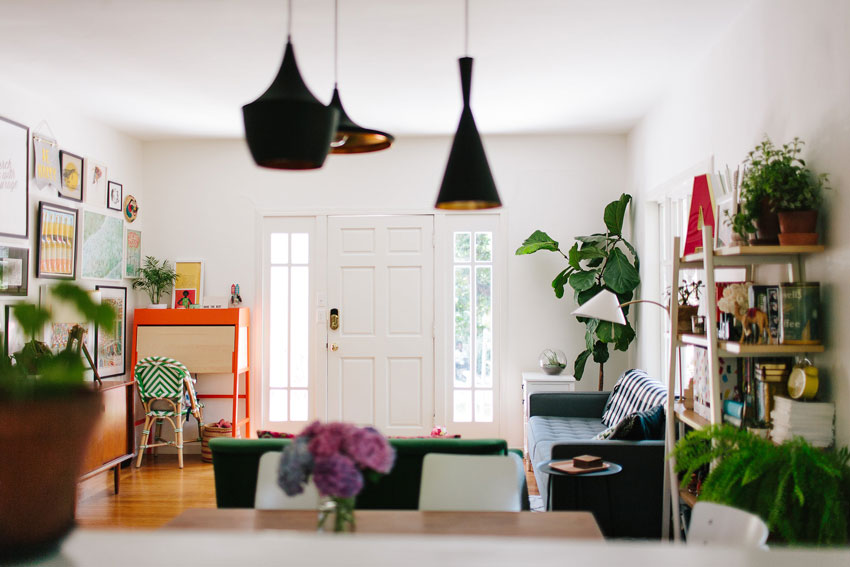
And this house tour for Design*Sponge. I love the use of color, texture, patterns and neutrals. I love how this house gets so much natural light and they really take advantage of it. Each space has a lot going on but it never feels like too much or that it’s overdone. Plus, I’ve been coveting those black and gold pendant lights over the dining room table for years. Also, how cute is that exterior?! Check it out here.

I hope you find these links helpful, inspiring or, at the very least pretty to look at. And what do you think of this column idea? Yes, no, maybe so?


