Client Project: #LivingLaLincolnCenter
Way back when, I introduced you to a new client project I’m working on, a full renovation and design of a condo near Lincoln Center in Manhattan. The couple moved from L.A. to NYC with no furniture, bought a one-bedroom apartment and have been having it renovated to turn it into a two-bedroom apartment to use the second bedroom as an office/guest room. The client, who I have dubbed #LivingLaLincolnCenter, has a good eye for design, a strong perspective and knows exactly what she wants. She enlisted me to help with the decor of the master bedroom, office, dining room and living room. Months ago, I introduced you to the living room, which you can see here and here. The renovation of the apartment is near complete and it’s all coming together so well. I can’t wait to be able to share the final home with you. BUT! I realized I never introduced you to the rest of the apartment and design ideas, so here is an introduction to the dining room.
As a reminder of how this place started and an explanation of some of the design and color choices, definitely catch up by reading the initial post of this Lincoln Center project here and more about the lighting situation here.
Here is how the dining room looked initially (I took these photos when they had guests visiting, hence the air mattress):
Since the dining room shares the same space as the living room, as you can see in the photo on the left, the colors, textures and overall vibe of each room needed to make sense with each other. On the other side of the room where a hallway leads to the master bedroom and bathroom is wall space to add a credenza or console table and other decor. This area is what you see in the photo on the right. This also needed to make sense with the rest of the space.
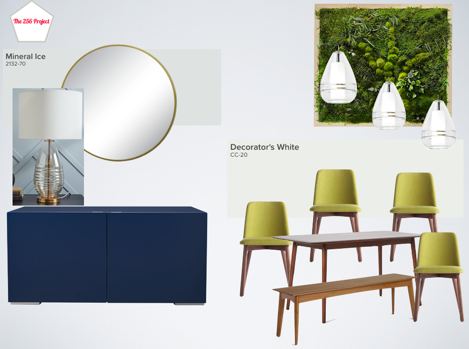
For the dining room, she was looking for a wooden table, chairs with colorful upholstery, pendant lights, and wanted a living wall that looked like an art piece. I also suggested the credenza and art work for the extra wall leading towards the hallway.
She had already found these dining chairs from Blu Dot in walnut/bright green and purchased them, so I created design options around these chairs. She also had already chosen paint colors during a separate paint consultation. The pendant lights we chose together during our lighting consultation. We needed to find a narrow dining table so the walkway from the entry to the living room is not blocked and we thought a bench would be helpful to help collapse the space when needed. With these chairs, paint colors and pendant lights in mind, here are the three design directions I presented for the dining room:
Option 1:

Dining table and bench, no longer available / chairs / living wall / pendant lights / mirror / floor lamp / console table, Target, out of stock
Option 2:

Dining table and bench, see above / chairs / living wall / pendant lights / mirror / table lamp from West Elm, no longer available / console table, Target, out of stock
Option 3:

Dining table and bench, see above / chairs / living wall / pendant lights / mirror / table lamp from West Elm, no longer available / credenza
She liked options 2 and 3 the best. At this point, the seating area of the dining room is almost finished and we are still weighing options for the credenza/console wall but I think the blue credenza with the glass lamp that mirrors the pendant lights almost perfectly is my preferred option for that area. Another option I suggested is adding a large, vertical mirror to lean against the wall with a small console table to act as a drop zone for keys, etc. The reason being that, with all the low, horizontal lines of the furniture she currently has in the space, I think we need to play with the lines the eyes see when surveying the room.
The second bedroom/office has been carved out of the wall to the right where the TV is in the below image. The new room takes space from this living room and from the master bedroom which, in this photo, is just on the other side of the wall on the right. The office/guest room will be separated from the living room by a frosted glass wall with sliding doors. This is the last part of the renovation that is underway and I have no doubt it will look fantastic. She has already almost completed purchasing items for this room and it is looking great. (There is a bright yellow sleeper couch in there and you KNOW how I feel about color!)

Next up is the introduction to the bedroom, which I’ll share soon so stay tuned for that. For now, what do you think of the dining room ideas for the #LivingLaLincolnCenter project? Feel free to comment below.
* This post includes affiliate links.


