Client Project: Condo in the City of Brotherly Love, Part 1
I am very excited to share with you a new client project, a young family based in Philadelphia who recently traded in a rental apartment for their first taste of home ownership via a beautiful condo in the city of brotherly love. The Philadelphia project, which I’m calling #GiveMeLibertyandaGreatCouch (shout out to the person who suggested that name when I put out a call for suggestions on Instagram), entails totally decorating the entire first floor of the condo. So, here we go!

Here are the deets on the condo: It’s an end unit that gets lots of natural light (give me ALL the natural light!). The downstairs foyer leads up the stairs and into a kind of landing/entryway on the first floor, which is then split into two sections: one section is the living room with an alcove area, dining room and powder room, and the other section is the kitchen, breakfast nook and family room. (The breakfast nook leads out to a covered balcony, but that wasn’t part of my project). There are 9-foot ceilings throughout. There is so much more to this condo, including a huge roof deck, that I wasn’t tasked with touching, but the entire condo is amazing.
The #GiveMeLibertyandaGreatCouch client shared some specifics with me (I love a client who shares specifics): She and her husband like pops of color and patterns, but doesn’t know how to incorporate them and they tend to lean toward white/gray and gold for neutral colors. They like modern with classic and traditional elements. Because they have a dog and young son, they want fun, functional and unfussy design, as in no furniture or decor that they will fret about being dirty or slightly broken or scratched. They want their home to feel relaxed, calm and homey. Because their previous apartments had a hodgepodge or furniture handed down to them or given to them from various sources or purchased over the years on a budget, they had never felt before like they had a cohesive home that truly reflected them. They want a home that feels put together, where they are proud to invite people over.
If you were ever wondering why style matters, why design matters, why home decor matters, that says it all right there. Because of all those feelings she shared with me about how she has felt about their previous homes and how she wants their first owned home to feel, I set up some strict criteria: Everything about this project has to put the “fun” in functional, has to make the place feel like them, and make them happy. If there was anything that we were looking at that didn’t fit that criteria, then it had to go. This included pieces that they already had or pieces that she is looking at and sending to me for review before purchasing.
There were a few other things the client said up front: they were on a budget as they were doing a master suite remodel and furnishing a 3-bedroom apartment all while moving in, and they are required to have a lot of rugs.
Here are a few inspiration images we landed on:
Today, we’ll focus on the kitchen, breakfast nook and family room half of the first floor and, next week, I’ll introduce to you the dining and living rooms.
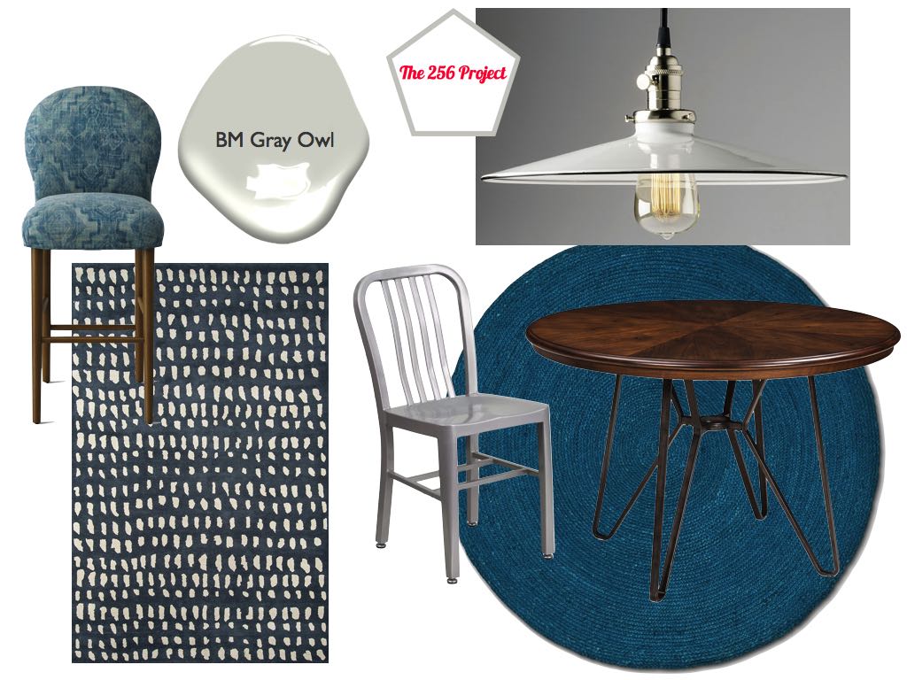
For the kitchen/breakfast/family rooms, the shopping list included rugs for all three areas, seating, some lighting, decor, and paint color. She already had just purchased chairs for the breakfast nook so I was designing based around those. For you budget conscience folks out there, she is finding a lot of stuff off Craig’s List and Facebook Marketplace in her area so she can see the merchandise before buying. You might want to consider the same for your own home.
Based on all of this initial information, here are the different moodboards I came up with for each space within this area of the first floor.
Option 1


Option 2


Like I said, these moodboards were based on the initial information she sent me. I leaned heavily on the budget. She didn’t give me an exact budget to start but clarified afterward that she wasn’t *that* on budget. She also was scanning sales to see what furniture she could buy all while I was working on my own research, so I was constantly going through the items she was sending me and reviewing what she was considering purchasing. Based on all of this conversation and items she had purchased, I put together this modified moodboard for this area of the home.


At this point, the client has moved in, the entire house is painted, electrical has been taken care of, and we are still finalizing the remaining furniture and decor choices. Things are changing weekly. I hope to be able to share with you the final Philadelphia project when it’s all done.
In the meantime, if you are interested in working with me on an interior project of your own, email regine@the256project.com. To see other client projects, check out a living and dining room in Manhattan, a nursery in Honolulu, and an entire apartment in Brooklyn. Let me know what you think of these moodboards and design suggestions in the comments section below.


