Client Project: Condo in the City of Brotherly Love, Part 2
Last week, I introduced you to a new client project, which I’m calling #GiveMeLibertyandaGreatCouch. I shared with you the details of this Philadelphia project, inspiration images and the initial moodboards for the kitchen, breakfast nook and family room, all of which are on one side of the first floor of the condo in the city of brotherly love. To catch up on #GiveMeLibertyandaGreatCouch, check out my initial post here. Now I’m going to introduce you to the other half of the first floor, the dining and living area and powder room.
You can see in these real estate photos that the living and dining rooms are connected. You can also see that the living room has an alcove that includes built-ins. You might also notice all the natural light with all of those windows.

The #GiveMeLibertyandaGreatCouch clients like pops of color and patterns, leans toward white/gray and gold for neutral colors, and likes modern with classic and traditional elements. Because they have a dog and young son, they want fun, functional and unfussy design, as in no furniture or decor that they will fret about being dirty or slightly broken or scratched. More details on the design they are looking for are in my first post.
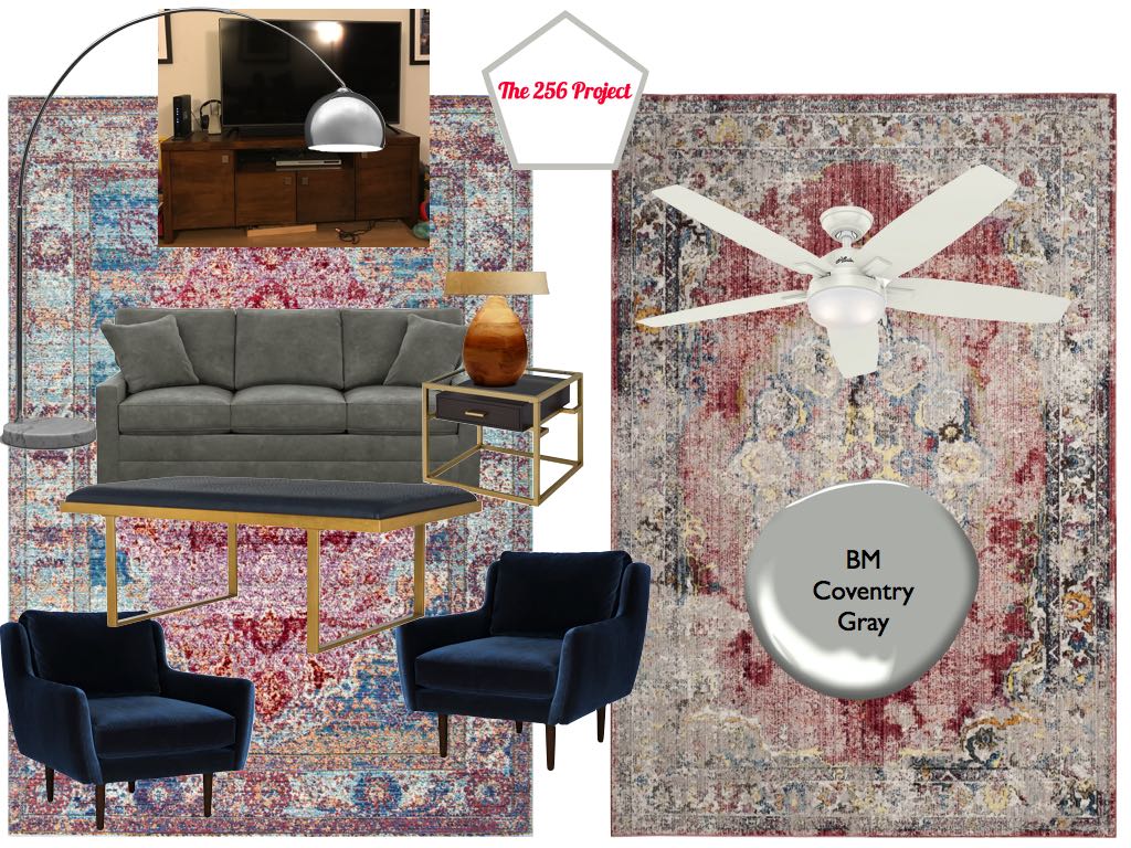
When we first started working on this project, the client wasn’t sure if she was going to keep the built-ins because she thought it would be easier to tear them down to allow them to turn the alcove into a fourth bedroom or office down the road should they need to close off this space. I first designed this area with keeping the built-ins in mind and making them a wow statement. She also already had a gray sleeper couch from Ethan Allen that she wanted to incorporate so I gave her two options for the living room that included the gray couch.
Since the family room area I was suggesting was a lot more fun, I wanted the living and dining rooms to have a little more of a “grown and sexy” vibe, but still functional and comfortable. As you can see from the options, I made sure the colors and patterns all spoke to each other since the dining area and two parts of the living area are all one large room.
Option 1


Option 2


The #GiveMeLibertyandaGreatCouch client had been doing a lot of research on her own, paint color testing and shopping so, based on her feedback and latest finds, I amended the living and dining room options. One major decision was to remove the built-ins so that affected several design decisions.


Last but not least is the powder room. It’s small, as most powder rooms are, so I wanted to give it big impact without taking up much room. I suggested two options, each with a wallpaper or color option.
Option 1

Option 2

She ended up skipping on the wallpaper and also deciding she wanted to replace the mirror, so I suggested this option instead.

At this point, the client has moved in, the entire house is painted, electrical has been taken care of, and we are still finalizing the remaining furniture and decor choices. Things are changing weekly. I hope to be able to share with you the final Philadelphia project when it’s all done.
In the meantime, if you are interested in working with me on an interior project of your own, email regine@the256project.com. To see other client projects, check out a living and dining room in Manhattan, a nursery in Honolulu, and an entire apartment in Brooklyn. Let me know what you think of these moodboards and design suggestions in the comments section below.


