Beautility Room: The Reveal
It’s here, it’s here, the beautility room reveal, finally! After almost three months of what was supposed to be a relatively easy and painless job and what felt like forever, we finally have a pretty good looking powder room/laundry room and mudroom. Want to see?!
There are so many things I love about these two new spaces but, before I get into all of that, let’s take a look back.
To recap, this area of our house was one of several areas that we knew we would renovate at some point, along with the kitchen and upstairs bathroom. In fact, I took on a very small Phase 1 mudroom project two years ago, which you can see here and here. You can see that we were talking about from the very beginning changing out the back door to something that is standard size and lets in light. We also originally talked about just replacing everything that we had but not making any other changes, meaning keeping the small corner powder room and keeping the mudroom/laundry room as one, which connected directly and only to the kitchen and to the back door. But, over time, we realized we wanted to make changes to the floor plan: combine the tiny powder room with the laundry area, and create a separate mudroom that was open to the back door and kitchen, as it had been, but also into the adjoining dining room so it would make the entire area feel more open and larger.
So that’s what we decided to do. I introduced the beautility room renovation to you here along with the new floor plan, showed you inspiration photos and the moodboard here, and gave a progress report where I also talked about all the problems we were encountering here.
Okay, now that we’ve gone down memory lane, are you ready to see the final result? But first, a few more before photos!


And now for the complete reveal!


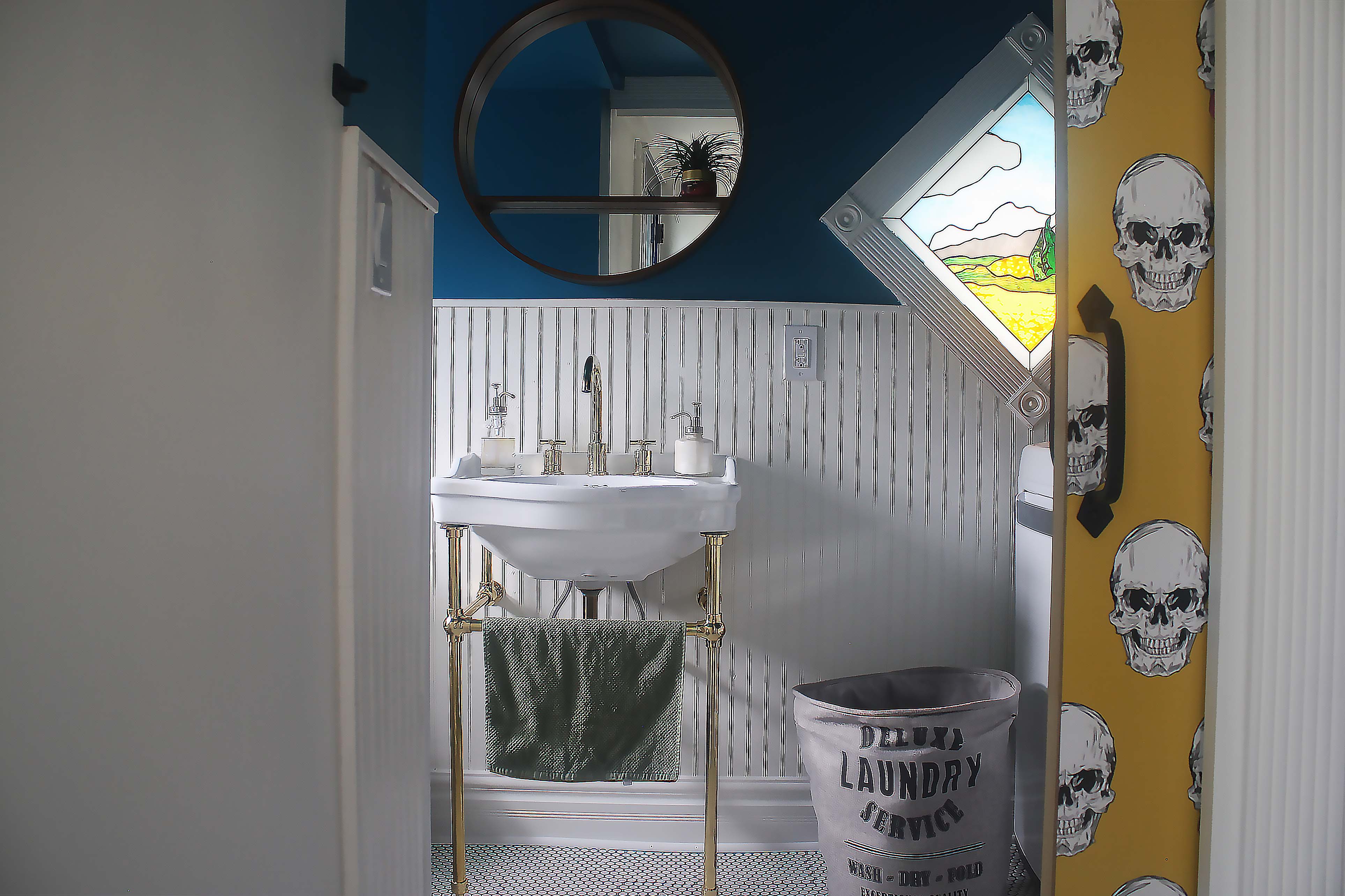
Emtek hardware with the round knob on the backdoor / backdoor paint color by Behr / wallpaper on pocket door from Walls Need Love / wall and ceiling paint color by Behr / penny tile flooring from Home Depot with natural gray grout color / striped washable mat in blue from Target


Console sink with brass stand from Signature Hardware / faucet in brass by Signature Hardware / flush mount lighting from Lamps Plus / toilet from Home Depot
The main gist of what we wanted to do with the new beautility room and mudroom was a mixture of bold and vibrant color, pattern, and vintage and classic elements. I think we achieved that with the vintage-like sink from Signature Hardware that I just love and serves as the centerpiece of the beautility room, the mixture of beadboard and painted walls, the vintage-style brass flush mount lights from Lamps Plus, the vintage-style molding around the windows and doors, the original stained glass window, the old radiator that we had cleaned and painted a metallic gold, and classic penny tile flooring. We put back the three shelves over the laundry machines that we had there previously, all of which come from a local salvage wood shop. Those are decorated with our laundry and powder room needs, as well as dog toys and treats, all in pretty baskets that we also had before.
We kept the mudroom simple, using bold color and pattern on the door only. Reason being, I wanted the funky and bright wallpaper on the pocket door to be the star. It’s a skeleton blowing bubble game and makes me very very happy. We reused our vintage wardrobe that we’ve had for years as our coat and shoe closet, added a few iron hooks from Target to the side to hold our dog’s leash and harness, and lightly decorated the wardrobe top with a few plants and a basket that we had in the laundry before.
Here are a couple of detail shots.


Iron door handle / mirror from Target / toilet paper holder / picture frame / iron hooks
So what do you think of the beautility room renovation? I hope you like it!


Comments
Love it! You are going to love this room so much. I wish I had something similar!
Thank you! And I love it too! It has changed the way I feel about our house.